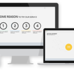
Last month saw a momentous milestone. According to the latest data from web analytics firm Statcounter, worldwide mobile and tablet internet usage has finally become more prevalent than desktop usage. It’s been a slow, inexorable rise, with mobile usage being around 40% 24 months ago, 45% 12 months ago, and finally, last month, it topped over 51%. The figures come hot on the heels of another milestone that had reached less than 6 months prior when Google announced that more Google searches took place on mobile phones than desktops and tablets in 10 countries, including the US and Japan.
That’s looking worldwide. How does the UK measure up? Generally, the UK is behind other countries, and it may well be at least another 12-24 months before mobile/tablet internet usage surpasses desktop use. Compare this with India, for example, which has over 75% internet usage through its mobile devices, or Japan, it’s over 76%! So even though we’re lagging behind many other countries, mobile internet usage is inevitably rising. This should act as a wake-up call to both big and small UK businesses–you must ensure your site is mobile-friendly.
Some companies got that message early and responded accordingly, with varying success. Some opted to run two versions of their site for desktop and mobile viewing, but this can be heavy on administration and risks one or other version not being kept up to date. Others opted for one mobile-friendly website and were often unimpressed with the overall result but stuck with it as the price you pay to be mobile-friendly. So, to all those business owners who baulk at their mobile-served website, you have to ask, ‘Aren’t an ever-growing number of your potential customers thinking the same thing?’ Of course, your site has other benefits, such as providing a better user experience for mobile views. Mobile compatibility has long been a ranking factor for search engines. This could give you an edge over your non-mobile-friendly competitors when prospects search for your services. This may be particularly worth considering for companies that operate in overseas markets where mobile internet usage is far more prevalent.
So, let’s assume you have decided to opt for a fully responsive website design. As you begin to populate it with content, it’s well worth being mindful of mobile usability, which is frequently overlooked. Mobile compatibility is how well your site is designed to work, but usability is how well the user interacts with it. The usability can soon be compromised by simple things like putting two links closely together in some body text. It may look fine on a desktop, but on mobile, it may be near impossible for a user to click on the link they want!
Finally, there are more significant considerations with mobile internet usage than purely your website design. It can be worthwhile considering your overall digital marketing strategy. For instance, your social media’s visual content may need to be optimised for mobile devices. Many pics that look great on a desktop can get radically cropped on a Twitter feed, or the text can be too small to read on a mobile device.
For a free, no-obligation review of your website, including mobile compatibility and usability, don’t hesitate to contact Cheltenham SEO services consultancy Ready Steady Go SEO.